


ブログをNext.js14(App Router)でリファクタリングしました


この記事では、React+TypeScriptでstyled-componentsのThemeを利用する方法について解説します。Themeに型付けする方法等の説明していますが、型情報を無視すればJavaSciripterでも読めます。
目次
Themeを使うと、styled-componentsで利用する値を『共通の値』として色々なパーツで使いまわせます。themeで値を一元管理することで、デザインの一貫性を担保できたり修正に強いコンポーネントの作成が可能となります。
なお、Theme以外のstyled-componentsの解説は次の記事で行っております。
まずは、テーマ(theme)をオブジェクトで記述します。
ここでは例として”main”と”sub”という値をthemeとして定義しています。
const theme = {
  main: "blue",
  sub: "purple"
}
このようにthemeとして定義したmainとsubは、styled-componentsのpropsから自由にアクセスできるようになります。
const Button1 = styled.button`
  background-color: ${props => props.theme.main};
  padding: 10px;
`

const Button2 = styled.button`
  background-color: ${props => props.theme.sub};
  padding: 10px;
`
ただし、themeを使いたいコンポーネントはThemeProviderで囲む必要があります。この時、定義したthemeをpropsとして渡します。
<ThemeProvider theme={theme}>
  <Button1>Button1</Button1>
  <Button2>Button2</Button2>
</ThemeProvider>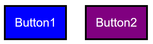
続いて発展的な使い方を見ていきます。
宣言のマージを利用して、Themeの型を型定義ファイル(d.ts)で宣言することができます。例えば、styled.d.tsを用意し、先ほどのThemeの型を宣言します。
import 'styled-components'
declare module 'styled-components' {
  export interface DefaultTheme {
    main: string
    sub: string
  }
}
DefaultThemeはもともと用意されている型ですが中身は空で、このようにThemeの型として拡張して利用することが可能です。あとはThemeの型が必要なところで、次のようにimportして使えます。
import type { DefaultTheme } from 'styled-components'『親ThemeProvider』の中に『子ThemeProvider』を定義し、子ThemeProviderの中だけでThemeの値を変更することが可能です。その際に利用するのが関数テーマ(function theme)です。
例えば、次の例のように、mainとsubの値を逆にする関数を考えます。
const theme = {
  main: 'blue',
  sub: 'purple',
}

const invertTheme = ({ main, sub }: DefaultTheme) => ({
  main: sub,
  sub: main,
})
親ThemeProviderにtheme, 子ThemeProviderにinvertThemeを与えると、子Themeの中だけでmainとsubの値が逆になります。
<ThemeProvider theme={theme}>
  <Button1>Button1</Button1>
  <Button2>Button2</Button2>
  <Space />
  <ThemeProvider theme={invertTheme}>
    <Button1>Invert1</Button1>
    <Button2>Invert2</Button2>
  </ThemeProvider>
</ThemeProvider>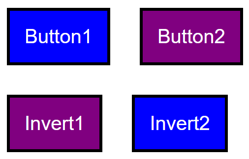
『styled.タグ』で定義したstyled-componentsではなく、通常のコンポーネントでThemeの値を利用する方法を3つ紹介します。
コンポーネントをwithThemeでラップすると、themeにアクセスが可能となります。
const Component = withTheme(({ theme }: { theme: DefaultTheme }) => {
  return <>{console.log(theme.main)}</> //blueと表示される
})
const Wrapper = () => {
  return (
    <ThemeProvider theme={theme}>
      <Component />
    </ThemeProvider>
  )
}useContext(ThemeContext)でThemeの値にアクセスできるようになります。
import { useContext } from 'react'
import { ThemeContext } from 'styled-components'
const Component = () => {
  const themeContext = useContext(ThemeContext)
  return <>{console.log(themeContext.main)}</> //blue
}
const Wrapper = () => {
  return (
    <ThemeProvider theme={theme}>
      <Component />
    </ThemeProvider>
  )
}もっとも簡単なのが、usetThemeカスタムフックを利用する方法です。
import { useTheme } from 'styled-components'
const Component = () => {
  const theme = useTheme()
  return <>{console.log(theme.main)}</> //blue
}
const Wrapper = () => {
  return (
    <ThemeProvider theme={theme}>
      <Component />
    </ThemeProvider>
  )
}styled-componentsのpropsにDefaultTheme型のthemeプロパティを渡すと、値がオーバーライドされます。
const theme = {
  main: 'blue',
  sub: 'purple',
}
const Button = styled.button`
  background-color: ${(props) => props.theme.main};
  border-color: ${(props) => props.theme.sub};
`
const Wrapper = () => {
  return (
    <ThemeProvider theme={theme}>
      <Button theme={{ main: "tomato", sub: "maroon" }}>Button</Button>
    </ThemeProvider>
  )
}
以上、styled-componentsのThemeに関連する解説をReact + TypeScriptで行いました。
その他のstyled-componentsの解説は次の記事で行っております。
最新の記事
カテゴリー一覧
アーカイブ